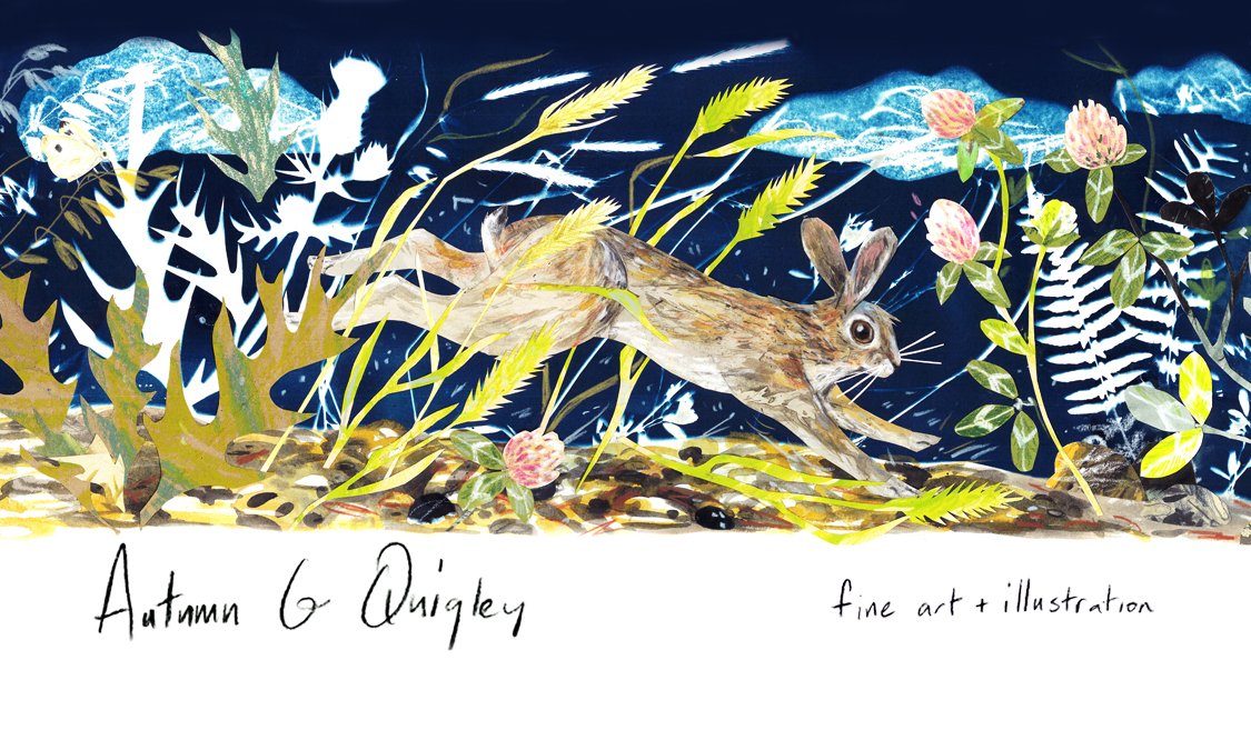


Sparkling Wine Labels for AniChe Cellars
Sometimes it seems like a lifetime between the early brainstorming stages of a project and when the work actually goes out to be met by the world. Never was that more true than this year! Rachel and Anais and I began this project back when we could snuggly and safely squish into a booth together in the winter of 2019/2020. But good things come to those who wait! These lovelies were released just in time for quiet holiday celebrations at home.
These sparkling wines are named for the fairies in A Midsummer Night’s Dream. Entering this project, the big question for me was how to keep the subject matter feeling classic while adding something new and modern. This is such a beloved work of Shakespeare’s, and there have been many illustration done in celebration of it, so it felt like a very big undertaking. We also wanted to maintain a bit of playful darkness with these images instead of them becoming too cute.
I had recently been exploring papercuts again and the graphic quality seemed like it might lend something contemporary to the imagery. The papercuts also remind me of shadow puppets and Greek black-figure pottery, which are both nicely referential to the play. Ultimately, I’m really happy with how these turned out and just love seeing them finally out in the world. Or I will, when we can all safely find ourselves out in it again.
Read more about AniChe Cellars and past label projects below. You can also find them here: http://anichecellars.com


AniChe Cellars
I had the pleasure of illustrating these labels for release Summer 2019 for AniChe Cellars in Underwood, WA. AniChe is a woman-run winery and the founders are great lovers of literature. Their tasting room sits in a sunny vineyard on the slopes above the Columbia River. Entering the tasting room though is stepping into a cozy woodland of Wild Things and Wonderlands. They take inspiration from their favourite literary works when naming the blends and in reimagining these select labels it was great fun to draw inspiration from Anais Nin’s Little Birds, J.K. Rowling’s Sirius Black, and Dante’s Inferno. You can find them here: http://anichecellars.com

Rose City Midwifery
Working with Portland, OR based Rose City Midwifery to reimagine their logo was an exciting challenge. The ladies wanted something that spoke to their styles and values and helped to convey to their clients who they are and what they could provide. We arrived at this final image after lots of deliberation around how to connect the baby to the idea of home, ideal thorniness of the roses, and how to maintain an approachable yet witchy vibe. For all your witchy midwifery needs you can find them here: https://www.rosecitymidwifery.com

Snowbrush Herb Festival
I feel really lucky when I get to illustrate for folks who are doing things that I feel excited and passionate about. I grew up in the woods and started learning about plants and herbalism from a very early age. Exploring that love and interest through art comes pretty naturally. This piece was used on posters, t-shirts and in other marketing for Snowbrush Herb Festival, which happens to be co-founded by my super amazing cousin Tiffany Bischoff. You can learn more about upcoming Snowbrush events here https://tiffanybischoff18.wixsite.com/snowbrushherbfestiva

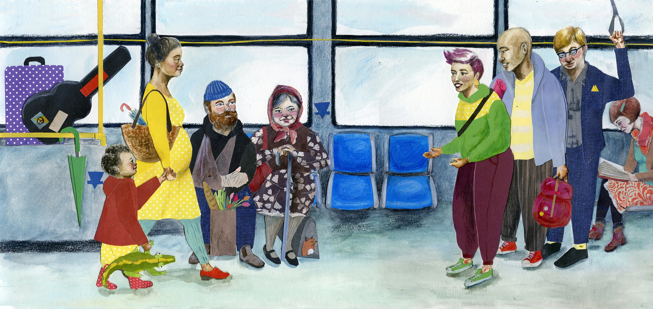
Translink Canada Etiquette Campaign
When I was living in Vancouver, B.C. and attending Emily Carr University Of Art and Design public transportation was a huge part of my daily life, for better or worse. This piece was used by Vancouver’s largest public transportation provider to spread awareness about etiquette and kindness while riding their skytrains, sea buses and city buses. It appeared just as I was making my exit from the city and it felt good to leave something behind that might make someone else’s experience a little better. Below you watch a video of Seth Rogan promoting the campaign!